E2 identity
Brand.
Everything that makes E2 look like E2. The logo, the colors, the type, the components, and the rules. When in doubt, come back here.
Two styles, one E2
Two styles.
We speak in two voices, and the line between them is deliberate. The website is bubbly and easy to read. The back-end tech is condensed and fast. Each card below is rendered in its own style, so you can feel the difference.
🎈 Website style
Bubbly and easy to read
Big friendly headlines, generous whitespace, emojis where a human would use them, plain words anyone can follow. This is the public face: the homepage, the character pages, the books. It should feel like a friend telling you something exciting. ✨
TECH STYLE
Condensed and fast
Dense rows. Small type. Monospace details. Live numbers, honest ETAs, zero decoration that doesn't earn its place. This is the back end: the queue, the servers page, Dave's OS. Mission control: everything important, nothing extra, readable at a glance on a phone at 2am.
Visual experiments
Visual Experiments.
New identity explorations, straight from the sketchbook. Nothing here is final until Dave says so.
Update language
How we talk about what's new.
Every E2 update follows the same grammar, so it reads in five seconds on a phone.
Our update language is short on purpose. Every update answers three questions: what changed, why it matters, and where to see it. One idea per line. Plain words. A link with every build, because if you build something, you link it. No progress reports, no staging theater. You only hear it when it's live.
We borrowed the calm from Notion. Notion's release notes and in-app What's New taught the internet that product updates don't need hype: clear hierarchy, generous whitespace, friendly plain language, one small delight at a time. Our version is the update card: a gray eyebrow naming what's most important, checkmarks for what's done, an inbox tray for what's queued, and underlined links that go straight to the thing.
Most important updates
- ✓Sloth: waving sloth logo, @sloth profile
- ✓Sally: simple SoundCloud players
- 📥Sloth landing pageETA 30 min
- ✓Agent Wire: Twitter-style cards
Anatomy: gray eyebrow, status mark, plain-English title, link to the thing, honest ETA on what's queued.
The SITREP
When asked for an E2 update, the SITREP answers instead: terse, no fluff, situation up top. One short clause per line.
Three visual styles.
1. Notion style. Emojis straight from Apple, and the E2 default. Status marks you read at a glance: green checkmarks for done, an inbox tray for queued. Emoji where a picture helps, underlined links that go straight to the thing, honest ETAs on what's queued. Lively, warm, still calm. You see it on update cards, the queue, and the to-do list.
Little icons. When a list item names a thing, give it a face. Small round avatar icons (30px) sit left of the text, like the mega project icons on /Mike: the llama for Llama Chat, the globe kids for E2 World, Chadwick's smile for his projects. The icon tells you what you're looking at before you read a word. Use them on mega projects, update lists, anywhere a name needs a face.
2. Minimal Notion style. The secondary style, and the whole look of Dave's OS. Same grammar, quieter clothes: soft gray boxes, image icons instead of emoji, and very small black-and-white micro icons marking each update, like the status marks at the top of /Mike and /d/. One bold title and one gray line of description per box. No pills, no color noise, nothing shouts. When a page needs to feel like a calm tool instead of a lively update, this is the one.
3. Notion micro. The tiniest style. Just the grey emojis and small grey icons, nothing else. No boxes, no titles, no color. A grey checkmark, a grey dot, a tiny grey icon inline with text. For status marks inside sentences, quiet metadata, things that should be seen but not noticed. When even Minimal Notion feels too loud, this is the one.
Minimal Notion style, live from /d/
 SlothOur own Twitter. All team updates.
 MikeEvery update, every two hours.
 QueueWhat's running right now.
Anatomy: gray box, image icon, bold title, one gray line. Grayscale status marks. Use it for tools and hubs; keep the emoji style for updates and announcements.
00
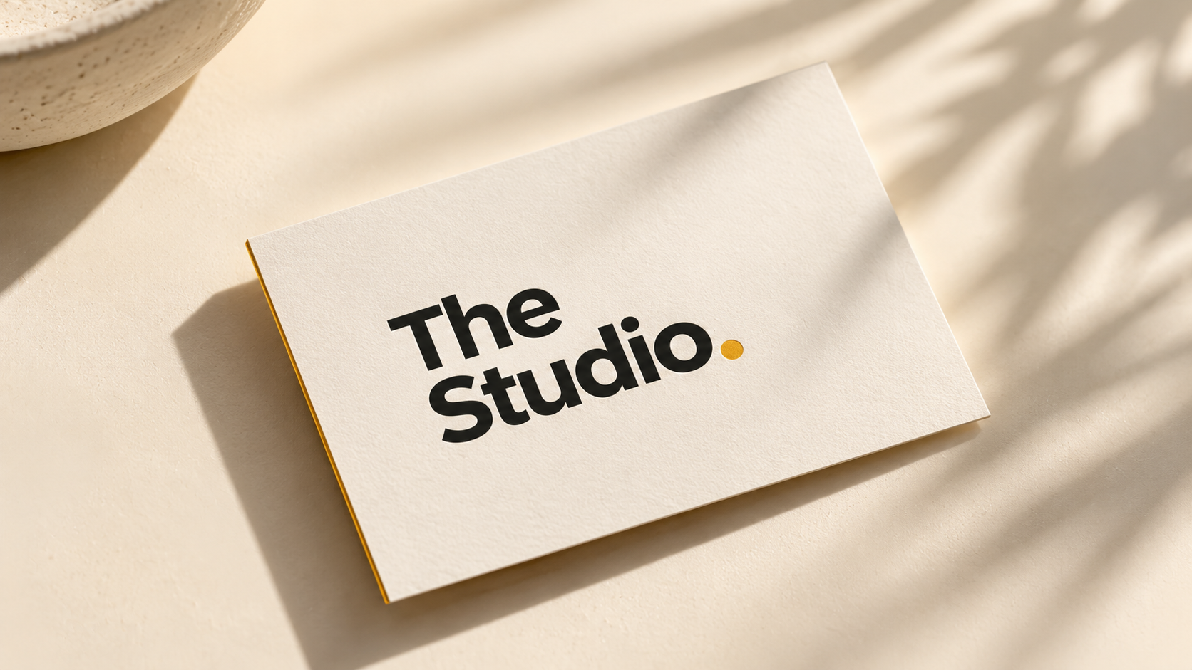
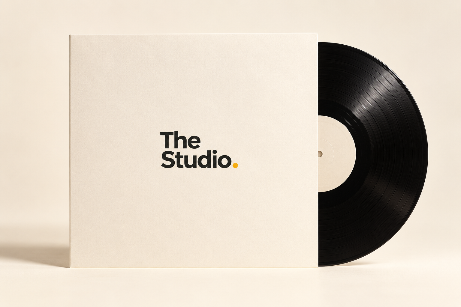
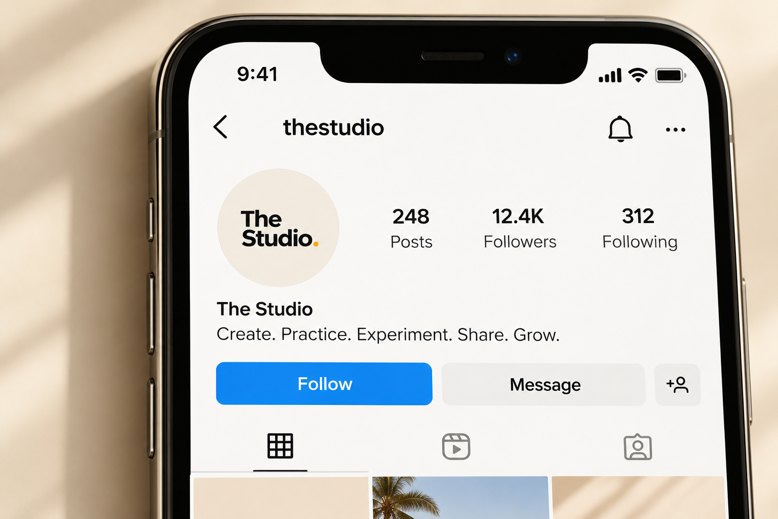
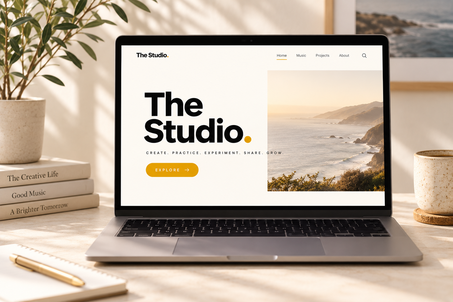
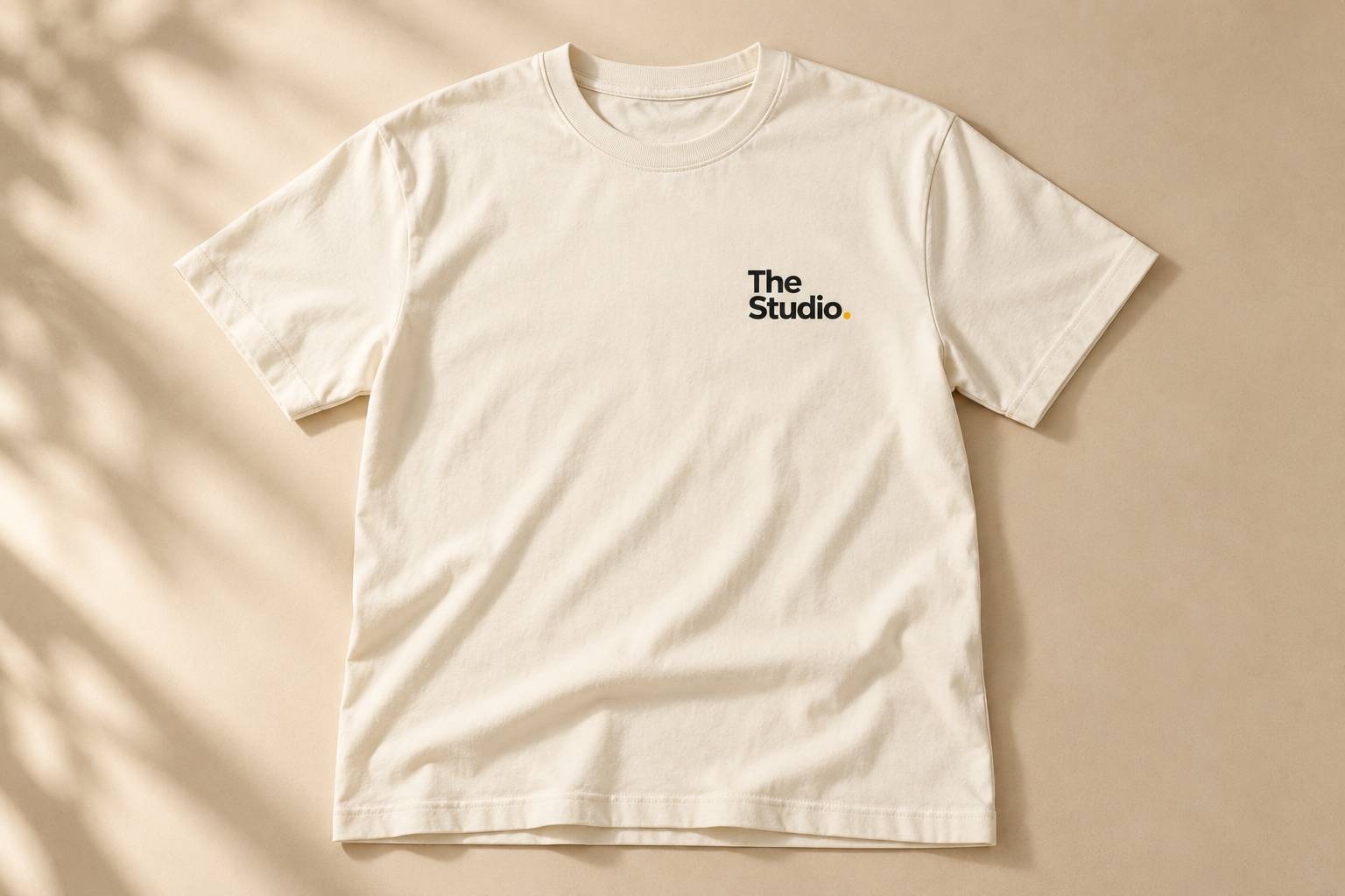
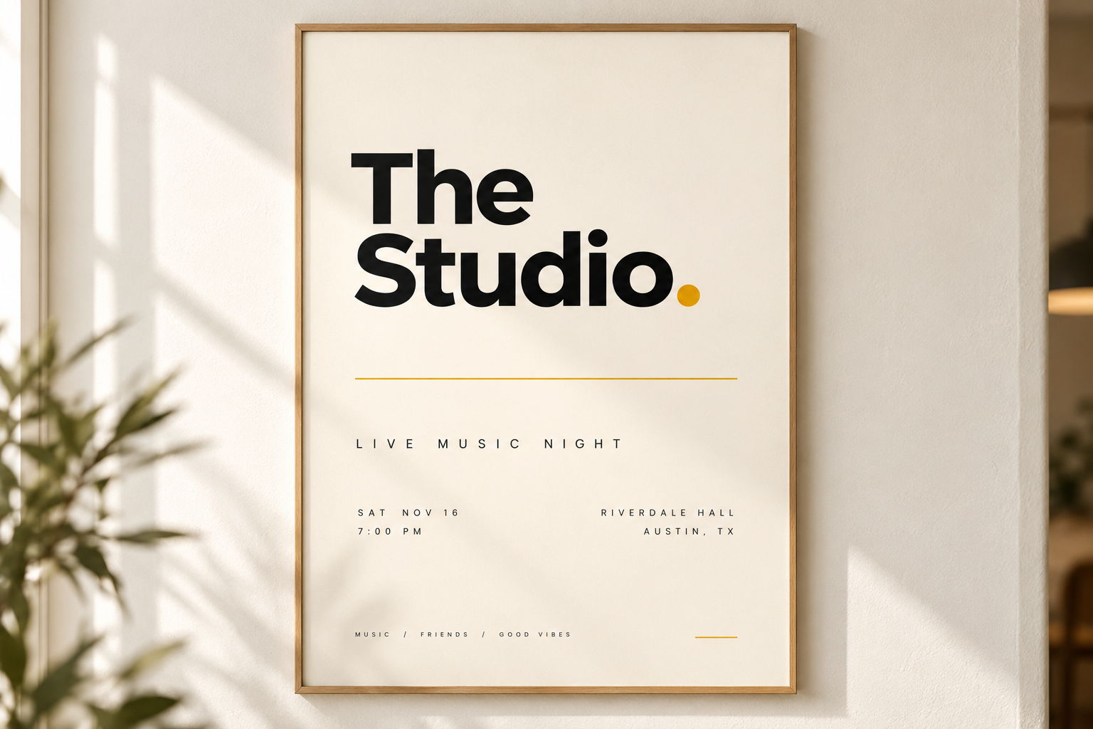
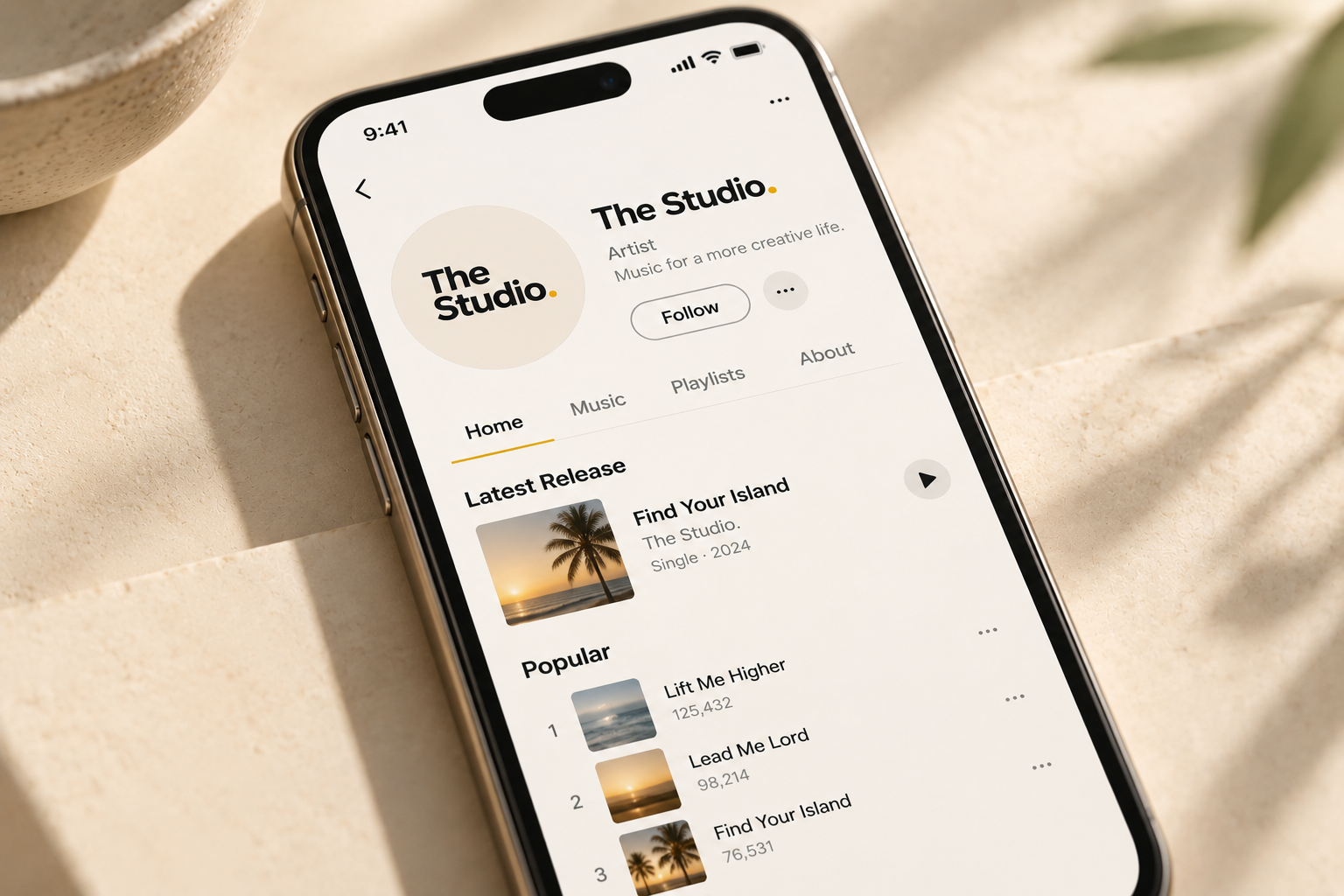
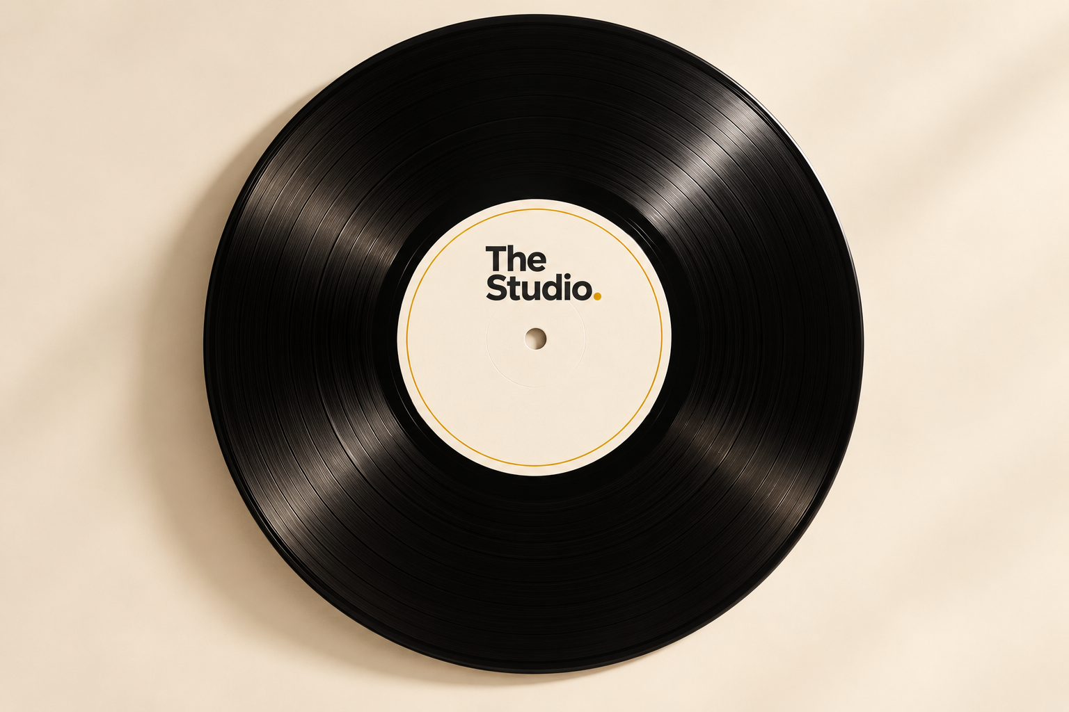
The brand in the wild.
What the identity looks like out in the world: print, merch, screens, and vinyl.
01
The logo.
One mark. The wordmark does all the talking.
E2.
Wordmark
Always title case, never all caps. The period is always gold (#b58520).
E2.
Wordmark, reversed
For dark backgrounds. The period stays gold.
02
Color.
Warm neutrals, one confident gold. Gold is the only accent that shouts, everything else whispers.
Gold
#b58520
The brand accent. Links, eyebrows, the wordmark period, primary buttons.
Gold Soft
#faf6ec
Tinted backgrounds, highlight bands, gentle gold moments.
Yellow
#f2ce57
Dashboard energy. Scoreboards, stats, moments that celebrate.
Ink
#1d1d1f
Headlines, body text, dark sections. Never pure black.
Gray
#6e6e73
Secondary text, ledes, captions. The quiet voice.
Light Gray
#f5f5f7
Section backgrounds, code blocks, calm separation.
Line
#e8e8ed
Borders, dividers, card edges. Barely there.
White
#ffffff
The canvas. Most pages start here.
Live Green
#34c759
One job: the pulsing live dot. Never used as a general accent.
03
Typography.
The system font stack, set with confidence. Big headlines, tight tracking, generous line height on body.
The stack
No web fonts, no loading, no flash. It looks native everywhere because it is native everywhere.
Headline
We build in the open.
Weight 800, letter-spacing -0.03em, line-height 1.05. Fluid size with clamp().
Eyebrow + lede
Fresh off the press
The quiet line under the loud headline. 20px, gray, sets up the section.
Eyebrow: 13px, weight 700, letter-spacing 0.14em, uppercase, gold.
Body
Body copy runs at 17px with a 1.5 line height, in Ink. It stays comfortable across long reads like the manifesto, the build log, and the Short Bus story pages.
04
Components.
The small pieces that repeat everywhere. Learn them once, reuse them always.
The live dot
Something is happening now.
10px circle, Live Green, 1.6s pulse. Marks anything real-time: the dashboard, the shipping feed.
Buttons
Pill shape, 700 weight. Gold for the one primary action, ink for secondary, ghost for quiet.
Eyebrow, headline, lede
Section label
The big idea.
The supporting line, in gray.
Every section opens with this trio, in this order. It is the rhythm of the whole site.
Cards
1px Line border, 20px radius, generous padding. Cards hold one idea each: a book, a song, a team member, a stat.
05
House rules.
The non-negotiables. These keep the brand honest.
-
1
It is "E2", never "E2.".
Title case, always. The all-caps version does not exist.
-
2
The artist is Dlaney. D-L-A-N-E-Y.
Pronounced "Delaney", spelled without the E. Never "Delaney" in writing.
-
3
No em-dashes, anywhere.
Commas, colons, periods, parentheses. The dash with spaces around it is banned from brand copy.
-
4
Never mention Suno in public.
It is the sketchpad, not the story. Public copy talks about the music, never the tool.
-
5
Gold is earned, not sprayed.
One gold accent per view is plenty. If everything is gold, nothing is.
-
6
Real over polished.
Honest empty states, real numbers, shipped beats perfect. The brand is a builder, not a billboard.
06
The tokens.
Copy-paste ready. Drop this :root block into any new page and it will look like us.
/* E2 brand tokens */
:root {
  --gold: #b58520;      /* primary accent */
  --gold-soft: #faf6ec; /* gold tint */
  --yellow: #f2ce57;    /* dashboard energy */
  --ink: #1d1d1f;       /* headlines, body */
  --gray: #6e6e73;      /* secondary text */
  --line: #e8e8ed;      /* borders */
  --light-gray: #f5f5f7; /* section bg */
  --white: #ffffff;
  --live: #34c759;      /* live dot only */
}